Menu Designs
by Celia Sin-Tien Cheng
May 1, 2009
An article on menu design in last weekend’s Financial Times was illuminating. It discusses how a restaurant’s menu, that should be a key marketing tool, is all too often difficult to read. The columnist, Nicholas Lander, asked British graphic designer Mike Dempsey the principles behind a menu that’s easy and attractive to read, and also asked him to critique 20 international menus.
Dempsey points out that the basic principles of good menu design are the same that drive the design of newspapers. As with all information design, a menu should be succinct and contain a clear hierarchy that’s easy to navigate. While clarity should always come first, a menu should also convey the restaurant’s personality.
“Beware the Small Print” is a must-read for all restaurant owners, or anyone like me with a passion for both food and design. I highly recommend looking it up on ft.com.
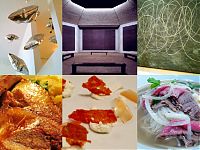
The New York Public Library houses one of the largest menu collections in the world. So, after reading the article, I decided to browse their Digital Gallery with Dempsey’s criteria in mind. The most recent menu in the collection, from The Modern, seems clear and conveys the restaurant’s personality well, but it’s also fun to identify the menus that don’t meet Dempsey’s standards.
If the Menu Collection piques your interest, you can register to access the actual menus in The New York Public Library’s Rare Books Division.
Happy menu browsing!
Credits: Click here for Longchamps Restaurant’s menu details and credits.
May 1, 01:11 PM
Great post! I’m trying to find new ideas for the company I work for. It’s amazing to see how menu designs have evolved from the 1800’s til present. Thanks again.
May 4, 07:46 PM
I have been engineering menus for 27 years and it has been fun to show how powerful a menu can be when someone has it in their hands! Some of the menus I work on for the chains help sell Billions and Billions of Dollars in food and beverage! Thanks for the nice article!










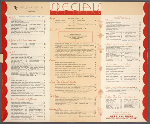 Longchamps Restaurant's menu from The New York Public Library Digital Gallery.


Comments (2)